Friday, December 28, 2012

Jumping Duck Records/Time Flies CD Cover

My friend Nathan TR Shaw asked if I could help him with his CD cover and record label. He wanted the best possible presentation possible for the release of his first album. I've always wanted to work on an album cover, so naturally, I accepted.

He and his wife already had a good vision and photos they wanted to use for the cover, so it was just a matter of pairing the right type to match the personality of the music and that fit it in the cover artwork (photos from their trip to Guatemala). I had a few choices for him and he chose Quicksand, a nice serif font with clean lines and smooth corners for a more approachable and friendly feel. Once the type was approved, I converted the CD cover to a banner to be used on his website.


Now for the hard part. He needed a logo for his record label, Jumping Duck Records. As far as I know, ducks don't jump. So how in the world to convey the concept? He didn't want anything cartoony either. So I ran through a few options. Maybe the "jumping" was the thumping of the music, so the duck could have headphones. The duck in a standing position in the center of the record.


After trying many variations and none of them quite working, I set it aside for a bit. When I came back to the project and did some more research, I found an fantastic shot of a duck taking off. While not jumping exactly, it might convey the idea a bit better. So I used the photo as reference and how had the image of a Duck "jumping", but it still wasn't quite working with the type. So I got some input from my friend and then did some more placement options until I found the right combination. But something still wasn't quite right...so I decided to adjust the letters: some above the baseline, some below to also convey the "jumping" aspect. This did the trick, the logo now had that dynamic quality it had been missing!


My friend and his wife were pleased with the results and hopefully, he will sell a lot of CDs. You can buy a copy of the finished CD starting today at his website: nathantrshaw.com

Tuesday, December 25, 2012

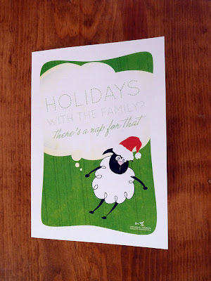
Holidays with the Fam? There's a Nap for That

Here's hoping your holiday season rocks, even if you have to spend it with your family... :P

May you have many awesome reasons to nap in 2013!


Friday, November 2, 2012

My original art for sale at DVAC's Art to Buy!

Over the summer, I decided to join DVAC (Dayton Visual Arts Center) as an outlet for the mounting collection of personal work I've been doing. I joined just in time for the annual member's show. This year's theme was No Borders, so my Dream Pig image seemed a natural fit. After a successful show (it sold!) I decided to participate in this year's Art to Buy.

I've worked up three prints for this sale: Dream Pig, Something Wonderful, and Dreamed It. They are available in 5x7 and 8x10 sizes.


I've also redesigned my Nap for That product line and I've got a Holiday Card featuring Nap for That's new mascot, Ned the Sleepy Sheep. This card is available exclusively at DVAC's Art to Buy and is very limited in quantity, get yours while you can! A BIG thanks to Annie at The Envelope for her help in not only the process, but making my Nap for That Holiday cards a reality—you are awesome!


Art to Buy starts today 5-8 p.m. at the DVAC gallery and runs through December 29. Come on down and see all the fantastic artsy finds for your holiday gift giving!


Sunday, October 28, 2012

Nap for That Rebranded!

Not long after Apple began it's "There's an app for that" advertising campaign, I was inspired to begin my Nap for That t-shirt line not only in jest, but also because I'm serious about napping. Just ask any of my friends, it's true. 


While the clean and simple typography was easy to work with, it still didn't convey the full amount of awesome that I believe Nap for That stands for, so earlier this year I began to rethink how I approached Nap for That. I wanted some sort of illustration/graphic that would connect with the audience more.

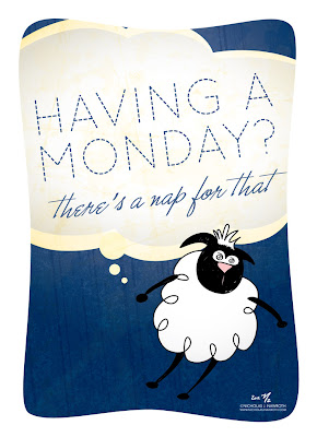
I began to reflect on sleep and naps (I may have even done some hard research in the napping department too... ;) After my research and some sketches, I figured a sheep would be the most appropriate new mascot for Nap for That. I wanted to keep that handmade feel to the finished illustration and after a few rounds, here is Ned the Sleepy Sheep! (Maybe I'm biased, but I just find him too cute.)


Now that Ned has been finalized,  I'm starting off small on relaunching the Nap for That brand, but have ideas for expanding the line up in early 2013. Keep your eyes peeled here for updates to the lineup as they happen!


Nap for that t-shirts, mugs, and posters would make an awesome gift for the napper in your life. You can buy 'em here at my Zazzle shop. Now through 10/31 Halloween Mystery Sale: save up to 20% on select items with code "OCTOBERFUN31" at checkout.

Local peeps you can purchase the limited edition Holiday Nap for That cards printed by The Envelope exclusively at DVAC's Art to Buy November 2-December 29. 


Nap on everyone!


Monday, October 1, 2012

Monday Fun: Graphic Design Emergency, Part II


Last week, I posted my Graphic Design PSA about Graphic Design Emergencies. This week, part 2...

Graphic design is a profession filled with deadlines. Many of them arrive too quickly, no matter how much time we as designers are given on a project. But I've always said, "there's no such thing as a graphic design emergency." And in my decade plus of experience, I've never seen a reason or project that warranted "emergency" status.

However, a bibe of cookies always seems to work wonders...

If you like it, you can pick up one at my Zazzle shop.


Monday, September 24, 2012

Monday Fun: Graphic Design Emergency.

Graphic design is a profession filled with deadlines. Many of them arrive too quickly, no matter how much time we as designers are given on a project. But I've always said, "there's no such thing as a graphic design emergency." And in my decade plus of experience, I've never seen a reason or project that warranted "emergency" status. As a service to my fellow professionals, I finally decided to make this reminder poster  for those times of frantic client calls so that you can make sure your frantic client gets the help they need!

If you like it, you can pick up one at my Zazzle shop.


Monday, August 20, 2012

Deamed it, did it...

A personal piece reminding me to dream big and then to go out an make those dreams happen...enjoy!


Thursday, August 16, 2012

Something Wonderful...

I saw the phrase "Something wonderful is about to happen." on a bumper sticker and decided to tweak it a bit and make my own inspirational image...enjoy!


Monday, August 6, 2012

Designer Math

I was flipping through my Pantone book the other day when I had this epiphany: designers don't "do" regular math, but they do have to do a different kind of math. Working with color is very challenging and getting consistent color whether it is in print or on the web is one of the most demanding parts of my job as a designer. Sometimes I get it right, sometimes I don't. Thankfully, there are tools that make it easier, but let's face it: there will always be that rogue printer or monitor out there that, no matter how much you try, it won't show you the right color.

So I thought it would be fun to do some posters showing the visual math that designers perform every day...enjoy!


Wednesday, July 25, 2012

Refreshing My Website!

The last time I redesign my website was 2008, and I had been meaning to update the design since about 2010, but client projects and a very full schedule have kept it on my to-do list until this year. While not a complete redesign of the site structure, I have changed a lot.

My new title is Instigator of Awesome! to demonstrate that not only do I do graphic design, but design consulting and art direction. It also conveys a sense of my personality better. I switched from the formal Futura to a casual script typeface, JB Bruno, for a more approachable feel. I ditched the heavy dark blue background for white to brighten up the whole site.

I moved my social media and website icons up to the top of the page so that folks could choose to view my portfolio or view my other website info first. I enlisted the help of my friend Annie, owner of the awesome stationery store, The Envelope, to clean up my bio and make it friendlier.

I also tweaked my self portrait illustration: softened a few lines here and there and made my smile a bit happier. I removed the geometric art deco background and replaced it with a watercolored textured background for a more hand-crafted feeling.

While I had intended to make additional pages and a place to sell my prints on this version of my site, I decided to leave it as is for now. This refresh was very refreshing and maybe on version 2012.2 I will incorporate some of my more grand ideas...


Wednesday, July 18, 2012

American Air Care

American Air Care Website


HVAC professional and my friend over at American Air Care didn't have a website. He'd tried working with designers in the past, but things just never seemed to work out. So late last year, he approached me to design his website. He didn't have much in the way of requirements: something that would feature his services and products along with contact information.

After researching the local competition and talking more with the owner, we decided that a one-page website would be the best bang for his buck. It would make it very easy for his customers to view their options and contact him without any of the unnecessary bells and whistles that added complexity and distraction like the local competitor websites.

The project moved slowly, but steadily until we had some issues with domain registration, which involved a name change for his business, but we were able to finally launch the site in June.

The client loves the finished site!

Saturday, June 30, 2012

WithOut electricity


Yesterday, we had 80+ mile per hour winds blow through our area and knocked out power to about 90,000 people. While my work lost power, I was fortunate to have power at my house. As I was talking with a neighbor about the situation he mentioned the abbreviation "woe" that he saw on a store that had no power. I realized the double meaning of this and thought it would make a great image if done properly since in this day an age, we are so tied to our electronic devices that when the power is out, not only are we With Out Electricity, we are woeful about the lack of access, games, and other entertainment these devices provide.

I was trying to figure out the simplest metaphor for having no power and as I woke up this morning, it hit me: a power button gone dark. The trouble is I couldn't make the background light either, otherwise it would ruin the mood. So it took a bit of tweaking to get the levels of dark just right on the text. Then I had to figure out just the right kind of dark for the background. I wanted to convey a sense of the power going out, so I added a gradient to the background where the black surrounds the text and goes a bit lighter near the top and bottom to convey a bit more texture and motion to the piece.

Wednesday, June 20, 2012

Free Fonts


I was talking to a friend the other about design related things. Somehow the conversation turned to type and I remarked to her that "free fonts are like a $20 hooker. You never know what you're going to get." She laughed and said, "that would be a great t-shirt." So I made it into a t-shirt and a poster for your enjoyment!


Like this? You can buy it as a poster and/or a t-shirt at my Zazzle shop.

Thursday, June 14, 2012

Designers do it in Helvetica.


Designers fell in love with Helvetica when it was first introduced, and that love has not subsided over the years. A clean and elegant font, it works well under a variety of conditions. It only seemed natural to pay tribute to one of the all-time favorite fonts in the world with a tongue-in-cheek verison of a the classic style Helvetica poster.


Like this? You can buy the poster and/or t-shirt at my Zazzle shop.


*Helvetica is a registered trademark of notype Imaging. Used with permission. Helvetica is available for purchase at fonts.com: www.fonts.com/font/linotype/helvetica

Friday, June 8, 2012

Forget Me (not)


My dad, Harry O. Nawroth, was diagnosed with Alzheimer's Disease in the final years of his life. He lost his fight last year on this date at the age of 83. Some days he had good days, some days not so good. But deep down inside, my dad was in there. I'm glad that he's no longer suffering. I didn't realize how far he had slipped away from us until he had passed away. As I perused old photos of him, I remembered how he used to be. I was mad at myself for accepting this new version of my dad in his final years. Even though it is a blessing that he's no longer suffering, there are many other fathers, mothers, and other family members suffering this disease. That's why I'm again participating in my local Alzheimer's Walk in September.


I had a vision of this print in my head since last year, and while it didn't turn out quite as I originally saw it, I think this version is much stronger.


The flower is a forget-me-not, which is the flower of September, my dad's birth month. I used blues tones because it was my dad's favorite color. The white/light blue lines of the flower represent the chaotic nature of the disease as it destroys the brain while the dark blue lines represent the person's true self that is being consuming.


The textures are rough and coarse, reflecting the aggravation of not only person suffering, but their family members suffering too.


The line "forget me" is easily legible, but the word "not" is nearly invisible to represent the lost of memory.


This print is not for sale, but for those who donate $35 or more to my Alzheimer's Walk, I will give away a hand-signed and numbered 11x17 archival print. Once the fundraising for 2012 is over, this print will not be made again.


Thursday, May 24, 2012

Life Sucks Then You Fly


I'm having fun with a new series of posters that I developed at the end of 2011 and 2012 that started with Dream Pig and Give Peas A Chance.

I love the simple iconography and type combined with a single, strong color for a quick, compelling story. I've tried to keep the feeling light and airy throughout. I think in a way, these posters are stress relievers for me.

I debated whether or not to use the PG or R rated version, but as my friend Bruce pointed out, people will get it, there's no need to be explicit. I still made the R rated version, but it's not for sale. ;)

You can pick up a nice 11x17 version of Life Sucks Then You Fly over at my Zazzle shop.

Thursday, May 17, 2012

Don't Give Me That Sheep


I'm having fun with a new series of posters that I developed at the end of 2011 and 2012 that started with Dream Pig and Give Peas A Chance.

I love the simple iconography and type combined with a single, strong color for a quick, compelling story. I've tried to keep the feeling light and airy throughout. I think in a way, these posters are stress relievers for me.

The newest entrant is "Don't Give Me That Sheep." I've made the background brown to convey what the sheep really stand for...if you like it, you can buy a poster (sheep and all) at my Zazzle store.

Wednesday, May 9, 2012

Resistance is Futile


Girl Scout Cookies are a yearly tradition as we transition from winter to spring. This year, as I was munching my way through a box of Thin Mints, I had a brainstorm: why not do a poster that celebrates the awesomeness of these addictive little cookies with the tagline, "Resistance is futile."

I chatted with my friends about their favorite cookie and it was almost unanimous: Thin Mints were the penultimate Girl Scout Cookie. I had a few boxes of different varieties, so I  photographed them all outside on my patio for reference. (The best part about this photo shoot was that when it was over, I got to eat the models. :)

I was going to work up several variant posters, but after seeing the Thin Mints, I decided this was the only version needed.


Monday, January 30, 2012

The Sleeping Beauty

One of my favorite pieces, The Sleeping Beauty, was chosen to be exhibited at the Gothic exhibit at the Orange County Center for Contemporary Art in Orange County, California from February 2 through March 24. This is the first time that my piece has been selected to be a part of a juried show and I was so very excited about the opportunity. 


The only issue was that the "print" existed soley as a digital illustration. I had originally created the piece in 2007 as an illustration and poem. I reworked it so that the poem and the image were integrated, adding a texture I shot in my driveway to tie everything together. I was happy that I finally was able to take the 2 parts and make them one complete image, which had been bothering me since I first created the image.


Unfortunately, the deadline for shipping was a week away and it needed to make it from Ohio to California in that time. I received the notice in the evening, too late to start work on finding local framing for it. So the next day, I tore out of work early to search my local stores for the frame that would best complement my artwork. 

I was in luck: Michael's had the perfect Victorian style frame that fit the theme of my piece and the exhibit and it was 50% off! I then purchased the cheapest poster frame I could find that fit the frame to protect the print. I hurried home and set my Epson r1800 to print on Epson's Radiant White archival inkjet paper while I assembled the pieces to make the frame.

Framing went pretty well (thankfully), and the next day, I headed to the UPS Store to have them pack and ship the piece. They couldn't guarantee a delivery time, but I took my chances since I couldn't afford to ship it overnight.

Luckily, The Sleeping Beauty arrived safely and on time and was shown in a high traffic area of Los Angeles. While I am bummed I couldn't make it out to the artists' reception, it was very cool to have my piece included in the exhibit with other great art!

I've now been inspired to complete the other two pieces in the series: Snow White and Cinderhella.

The text of the poem reads:

The Sleeping Beauty
Darkness fell upon the sleeping beauty.
Her pale face glowed by the moon's light.
Peaceful as she lay, her secret hidden.
Until the night a charming rider appeared,
Drawn to her side.
He pressed his lips to hers only to discover
She had taken away his last breath.


Monday, January 16, 2012

Dream Pig in 2012

I had a dream where there were pig shaped clouds against a pink colored sky. I woke up and had the title of the piece: When Pigs Fly. The idea stuck with me and I finally had some time this year to give the idea a whirl.

After creating the pig and his fancy wings out of basic shapes in Adobe Illustrator, I set up the basic layout. And it was perfect. I didn't need the clouds. Oh, I tried to add the clouds, but they wouldn't take. The clouds were too much, too overdone. The pig was perfect. But he just needed a tagline to describe his joy of flight.

We all dream big, but not too many of us Dream Pig: bigger than big, that impossible dream we hold dear to our hearts no matter what. Some folks give up on their dreams, but not those who Dream Pig. So in 2012 and beyond, don't just dream big, Dream Pig.

And if you want to show the world that you do Dream Pig, you can pick up some Dream Pig merch over at my Zazzle shop.

Thursday, January 5, 2012

Food & Wine Show Poster 2011

After spending time in Chicago and working on this year's Cheese Show Poster for my day job, I was in a retro deco sort of mood. Which was good because it was time to work on the poster for our annual Food & Wine Show. I've been designing the posters since this show's inception in 1998. It is always a fun challenge to design this poster since it is our biggest event of the year.

One night, shortly after completing the Cheese Show Poster, I was laying in bed drifting off to sleep and the idea for this poster just popped into my head. I quickly sketched it down on some post it notes I keep by my bed and went to sleep. I woke up the next morning and roughed out the idea for our Wine Director to see. He liked the idea, but wasn't 100% sold on it. I refined the idea a bit and he okayed the idea.

We started ticket sales in mid-September for this year's show. Exactly one week later, we sold out. The fastest sell-out in our event's history. While I'm sure other factors were involved, I'd like to think this poster helped. :)

Sunday, January 1, 2012

In 2012, Give Peas A Chance

I originally had the idea for this poster in late 2010. I envisioned a can of peas with the peace symbol on it. However, after some experimentation, I dropped the can idea and just went for the peas making up the peace symbol.

I bought a couple of bags of frozen peas and on one sunny summer afternoon this year, I took pics of the peas on a white sheet of paper out on my patio. I had to work quickly because it was hot and the peas were melting fairly quickly.


After I cleaned up the mess, I sorted through my photos and chose 5 peas to be the "ones". I then began the arduous task of hand placing each pea in its place along the peace symbol template.

Next I added some text with a faux watercolor effect and a light green background for a serene finish.

If you like what you see, you can purchase the Give Peas A Chance Poster, Card, Mug, and T-Shirt over at my Zazzle shop.